Aurora Energy
PAYG+ Prepaid Electricity App
Project Definition
Aurora Energy needed to modernise their prepaid electricity service so users could top up and track usage without visiting a kiosk.
This was especially important in Tasmania, where many customers faced increased hardship than mainland Australia.
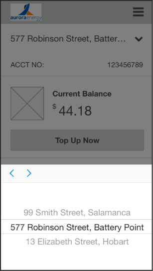
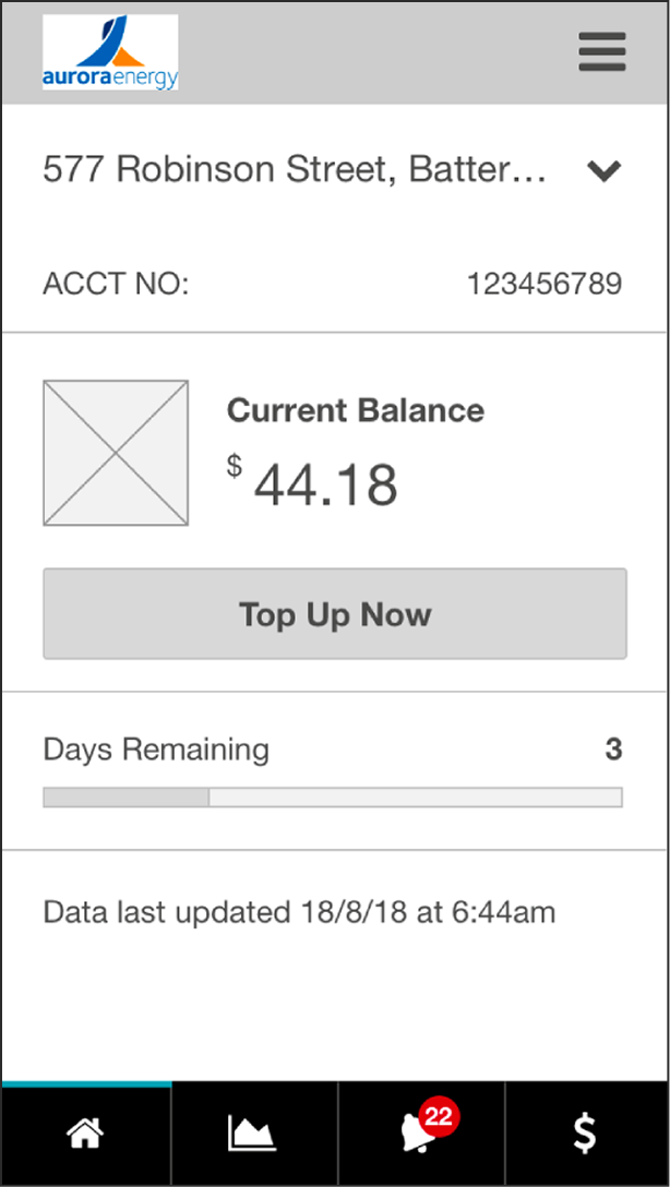
My colleague and I led the end-to-end research and design of a prepaid electricity mobile app built for low-income, low-literacy users.
The Problem
Grim tradeoffs, poor tools, no control
- Customers were going to bed at 5pm to save power.
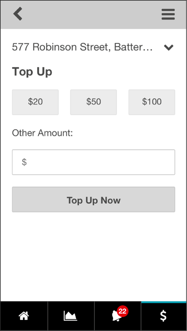
- Topping up required in-person visits, often far from home.
- No clear way to track usage or know when credit would run out.
- Existing interfaces assumed too much digital or visual literacy.
- There was no mobile-first, user-friendly tool for managing prepaid energy.
My Role
End-to-end design, daily iteration and testing under pressure
- Led product design from discovery through delivery
- Conducted interviews with prepaid users and financial advocates
- Ran daily design iterations based on direct user feedback
- Built working prototypes to validate early and often
- Advocated for accessibility, clarity, and real-world constraints
- Designed under tight timelines and emotionally high-stakes conditions
The Insight
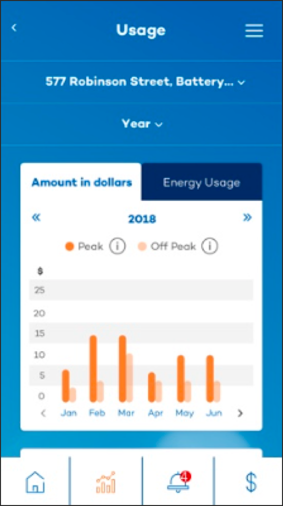
I initially designed a dashboard with interactive line graphs
- We thought it was elegant, with pinch, zoom, scroll functionality
- Users were confused, disengaged, or ignored the data
- We learned that line graphs assumed a kind of visual literacy many users didn’t have
- Testing revealed the core issue: too abstract, too techy
The Redesign
Clarity, confidence, and control… for everyone
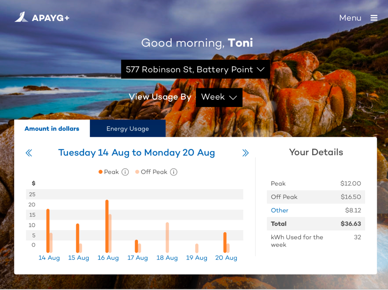
- Replaced line graphs with chunked bar charts showing credit used per day
- Reframed the dashboard around clarity, not cleverness
- Users immediately understood: “Yesterday I used $4, today I’m at $2.80. I’m doing better.”
- Visual simplicity restored confidence
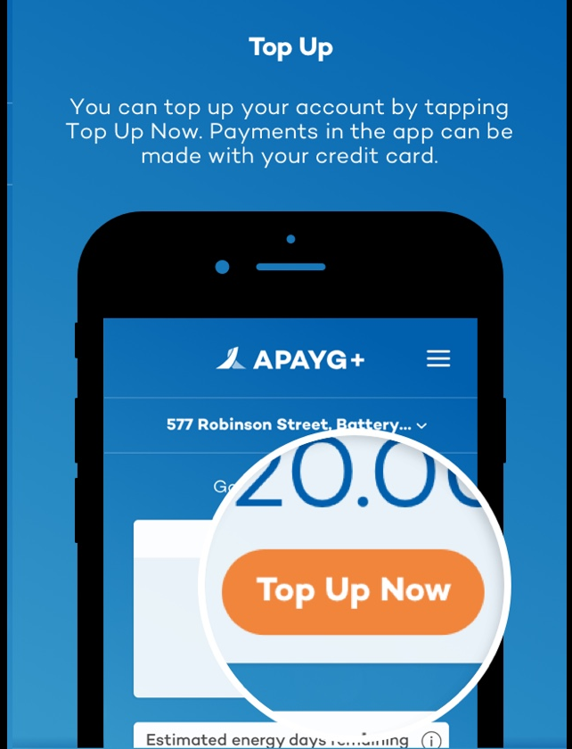
- Paired with top-up in two taps and clear alerts when credit was low
The Impact
Dignity, Agency, and award-winning UX
- Eliminated the need for in-person top-ups
- Gave vulnerable users visibility into usage and spending
- Supported behavioural change (e.g. reduced peak usage, better planning)
- Won 2019 AIIA Public Sector & Government Award
- Called out by Aurora for dramatically reducing support calls
Key Takeaways
You can’t fix what you don’t understand
- Assumptions fail fast in front of real users
- Visual literacy is not universal
- The best design isn’t clever, it’s clear
- Research must centre the most vulnerable, not the average user
- This project reminded me how good UX can protect dignity